Have you ever thought:
What’s the minimum I need in order to build a site?
I’ve thought about it quite a bit. So much so, I like to test my theories out in personal projects; in this case, my own portfolio site. However, I might have taken it a bit too far.
If I can create a simple functioning site using GitHub Pages and GitHub.com has a web interface, why can’t I build a site entirely in the browser? I mean, how hard could it be?
You said build Dave, not design!
I know, you’re right. That’s why I did this bit in Sketch before I got stuck into the meat & potatoes. I also used Dribbble to get feedback. After a few comments and rebounds, I ended up with a design I was happy to go ahead with.
Things started off great, but as I progressed further with the build, I realised that GitHub.com falls slightly short of what I really needed for the task at hand. I think the best way to describe it is by breaking things down a bit.

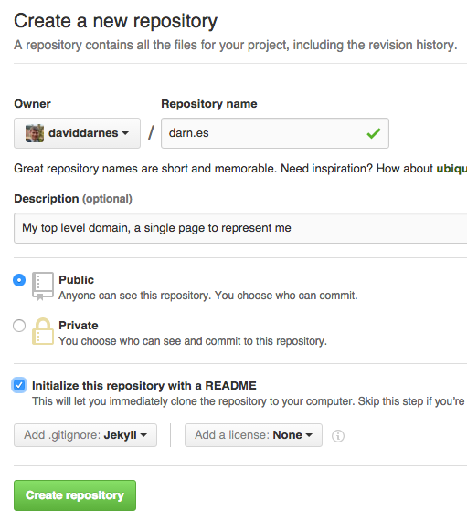
The setup process was easy. I find it kind of exciting when creating a new GitHub repo. The screen for it isn’t the most dramatic, but this is serious coding for adults. Then it’s just a case of creating the gh-pages branch and adding an index.html file to “Hello World” this party.
Because I’m not working locally, I can’t preview my changes and approve them before applying them to the live url (the live url being the very helpful one that GitHub gives you automatically: username.github.io/your-repo-name/). So, I removed the master branch entirely and just started committing straight to the live gh-pages branch. Needs must.
Despite doing this, the process of making a change and then previewing it was taxing. I understand that a lot has to happen before my site updates: Jekyll builds, then flush the cache and push to their servers. This might have been more of an issue if I wasn’t someone who enjoys front-end development; however, because I do, I don’t need to check the result that often. I’m quite happy to write a ton of HTML and CSS, and then look at the outcome way further down the line.
Writing front-end code in the GitHub.com interface is a pretty good experience for a web-based editor. It provides relevant syntax highlighting and it even automatically self closes HTML elements and CSS selectors. When I tested the code completion for this article, I was impressed to find that it’ll quite happily help you finish your code even when switching between HTML and CSS in the same file.

However, none of this works when you first create the file. The editor is dumb to it’s file name at point of creation. So, you have to create a blank file and then open it up again to benefit from even just the syntax highlighting. In case you’re wondering, GitHub uses ace editor, which is somewhat new to me, as most of the time I see code mirror being used.
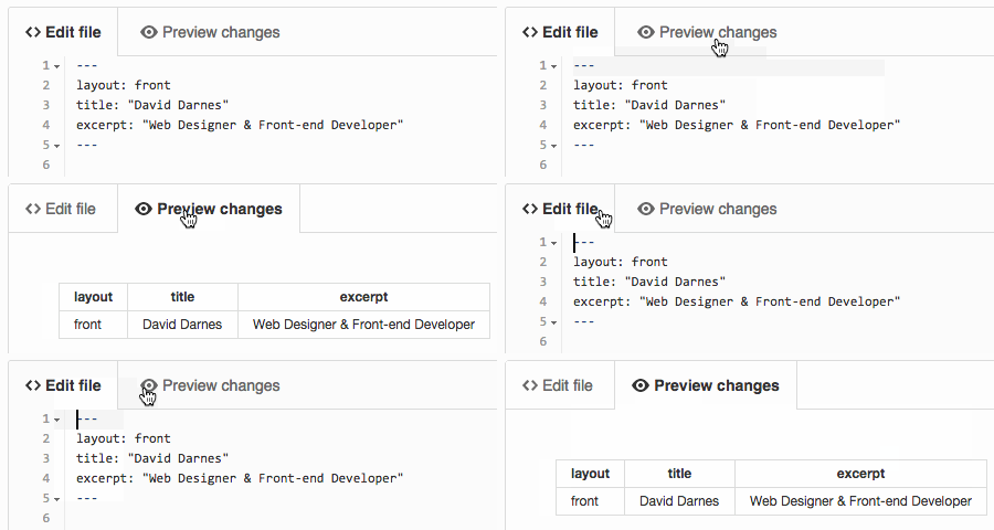
Any gripes I’ve mentioned pale into existence compared to the annoying locked text editor height! Over time, it’s become a right pain. The editing area takes up 90% of a regular laptop screen height and the commit button is right underneath. Because of this, every time I make a change on a file that’s taller than the text editor, I have to fight with the double scrollbars to get to the commit area. I don’t see why the editing area doesn’t grow with the code, thus removing the need to scroll inside it.
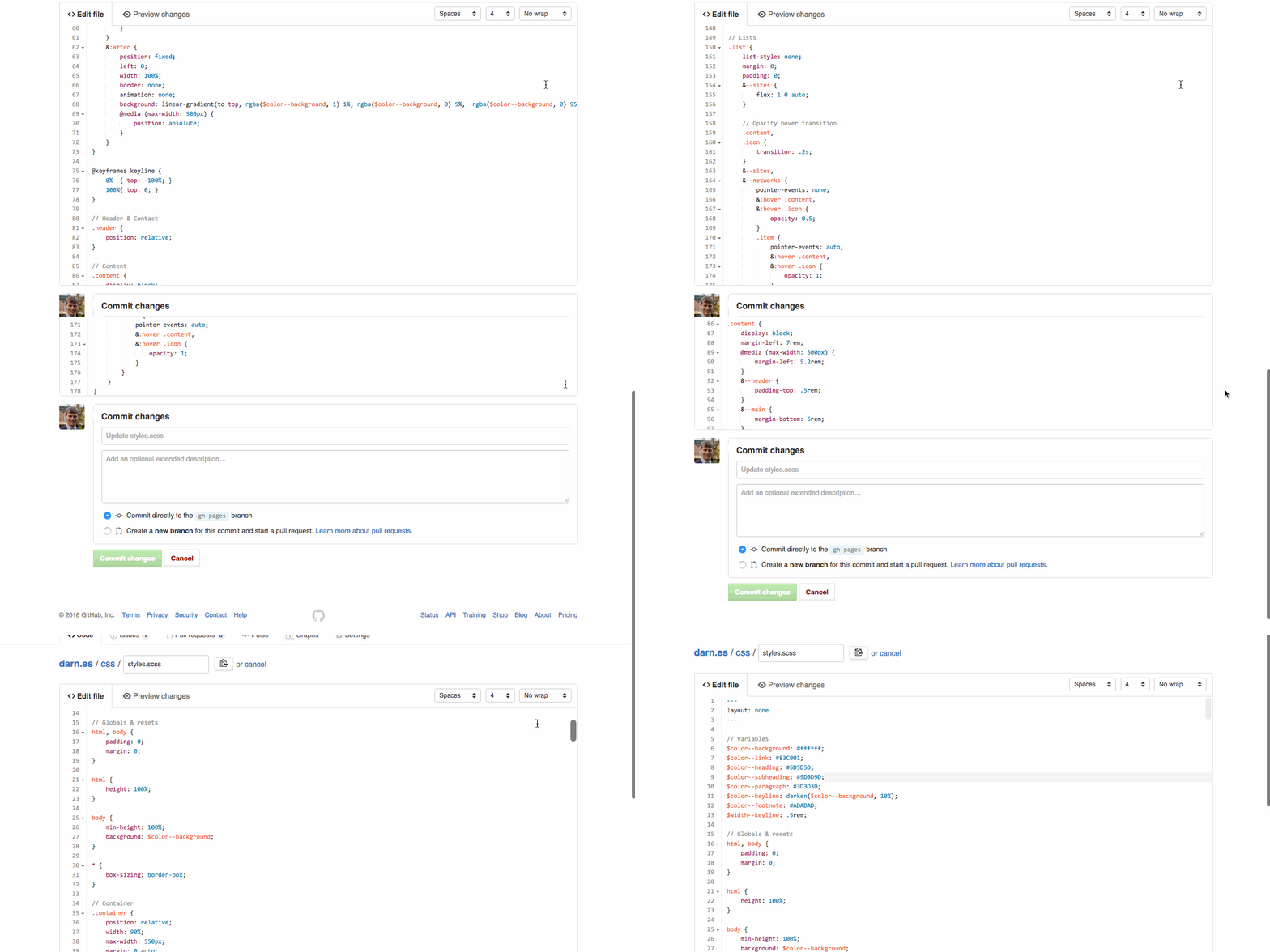
Alright, rant over. Lets talk about something good again… erm… I like that I can change the indent size in the top right. You don’t have to select anything either; the code just moves in and out. Wrapping is kinda useful, I guess. You can also change between using spaces or tabs for indenting. However, it doesn’t change any existing code, even if you select a line of code; it just applies when you write something new.
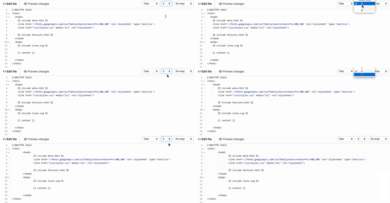
I’m big fan of markdown, especially since it stops people putting a single line of text into 4 paragraph elements and about 14 span elements. Despite Markdown being something that GitHub tends to tout, it’s not really well catered for. You get the same code editor as you do for any other file, but no auto completion, just syntax highlighting. At least the changes preview shows the processed markdown.
Surely they could think of a way to make writing markdown easier? Oh, wait - here it is in the damn comment box in issues!

But Dave, they only just implemented that into comments…

Nope. Try creating new wiki page. That markdown editor has been there for ages. If that was in the code editing area, then they’d be on the road to making a damn fine writing space for Jekyll bloggers. Of course I’m being way too harsh. Writing markdown isn’t that hard. I just think GitHub isn’t making the most of it - they seem to be using md files more and more.
YML files are a clean, crisp pillow against the rough, worn out, tassel stitched cushion that is JSON. I’m sure JSON has it’s place in the dev world, but using YML to manage data on a Jekyll site is tons easier than it might’ve been. GitHub.com provides almost nothing to help edit YML data. The only aid I’ve seen is that front matter, the small piece of YML data at the top of Jekyll markdown pages, get’s transformed into a table layout for slightly more readable view. I’m not going to complain about the lack of tools when YML allows me to manipulate complex data with ease.
This was nearly the end for my endeavour. The other issues were just user experience; this was an actual blocker. There is currently no way to upload images to a repo via GitHub.com. The only, and I mean only, way is to upload them to an issue.
Wait a minute, Dave. Isn’t there a way to upload images in the wiki markdown editor?
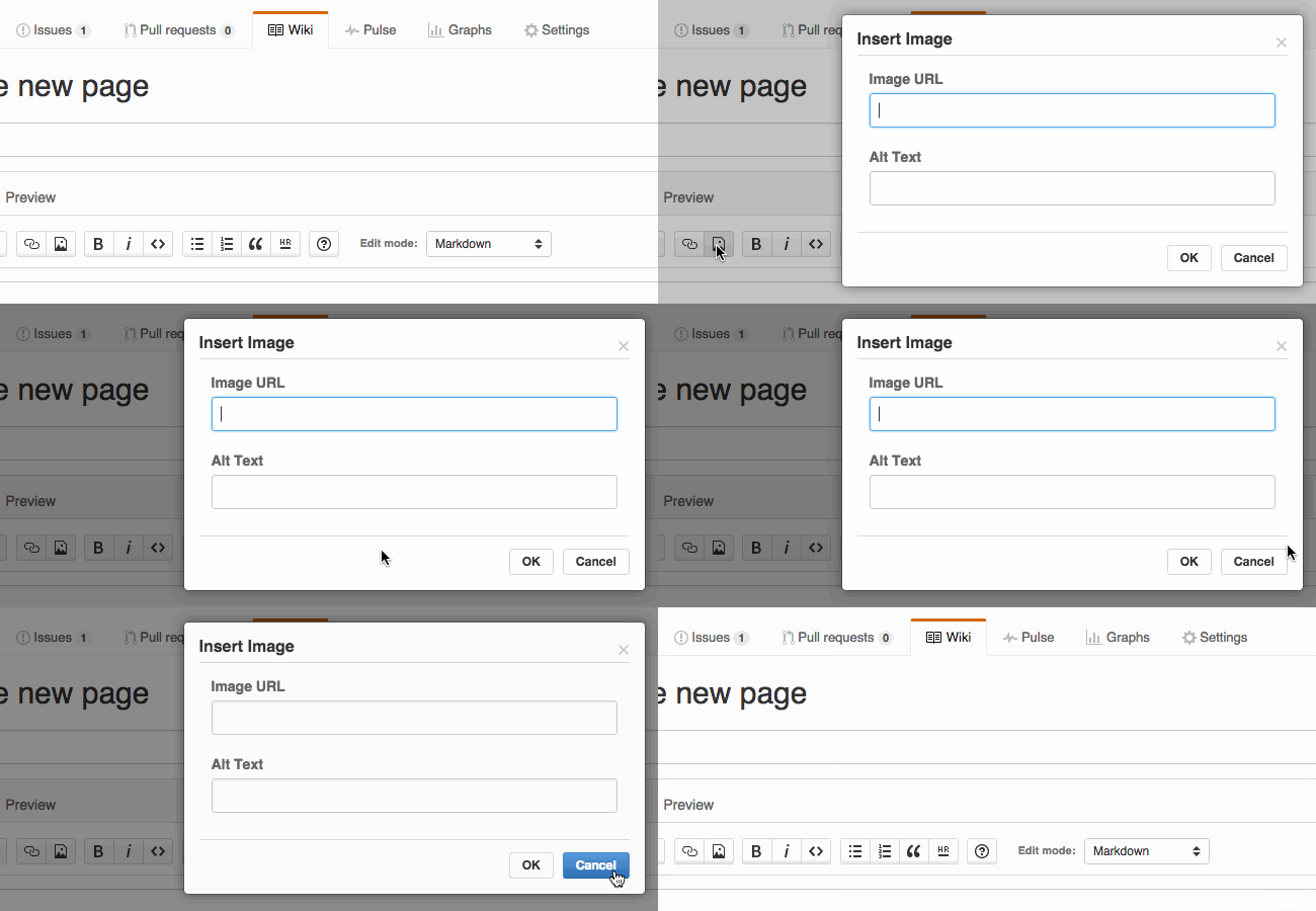
Haha nope. That’s a clever joke one from GitHub. It only allows you to use a url - another inconsistency with the comments markdown editor.
As soon as I discovered that, I thought “Nope, nope, nope, nope. I’m not using issues to upload content”. I’m really surprised this is not possible. Even a simple upload file button would do. Adding a size limit would be ok - if anything, it would make sense.
Due to this hurdle, I had to get smart, so in stepped SVGs. I collated them together and created an icons.svg file containing all the icons that will represent each of my projects and any other iconography I’ll need. The only actual image on the site is my avatar, which is subsequently used for all my favicons. To do this, I’m taking advantage of GitHub’s avatar url and the resizing option. Not only can I resize the image with the url to the exact pixel, but whenever I update my GitHub avatar, my site updates as well. If you want to find out your avatar url, just copy the image address of your avatar on your GitHub profile page.
The workarounds have caused me to use techniques that actually make the site better. I still think GitHub.com needs a way to upload images and general graphics. I’d put it at number 1 on my list, but I’m pleased it forced me to get smart with my site.
Hours from me posting this article GitHub drops the bomb that is file uploading. I know! The one biggest gripe of this project has now been solved. Nice job GitHub! Look at it, isn’t it glorious:
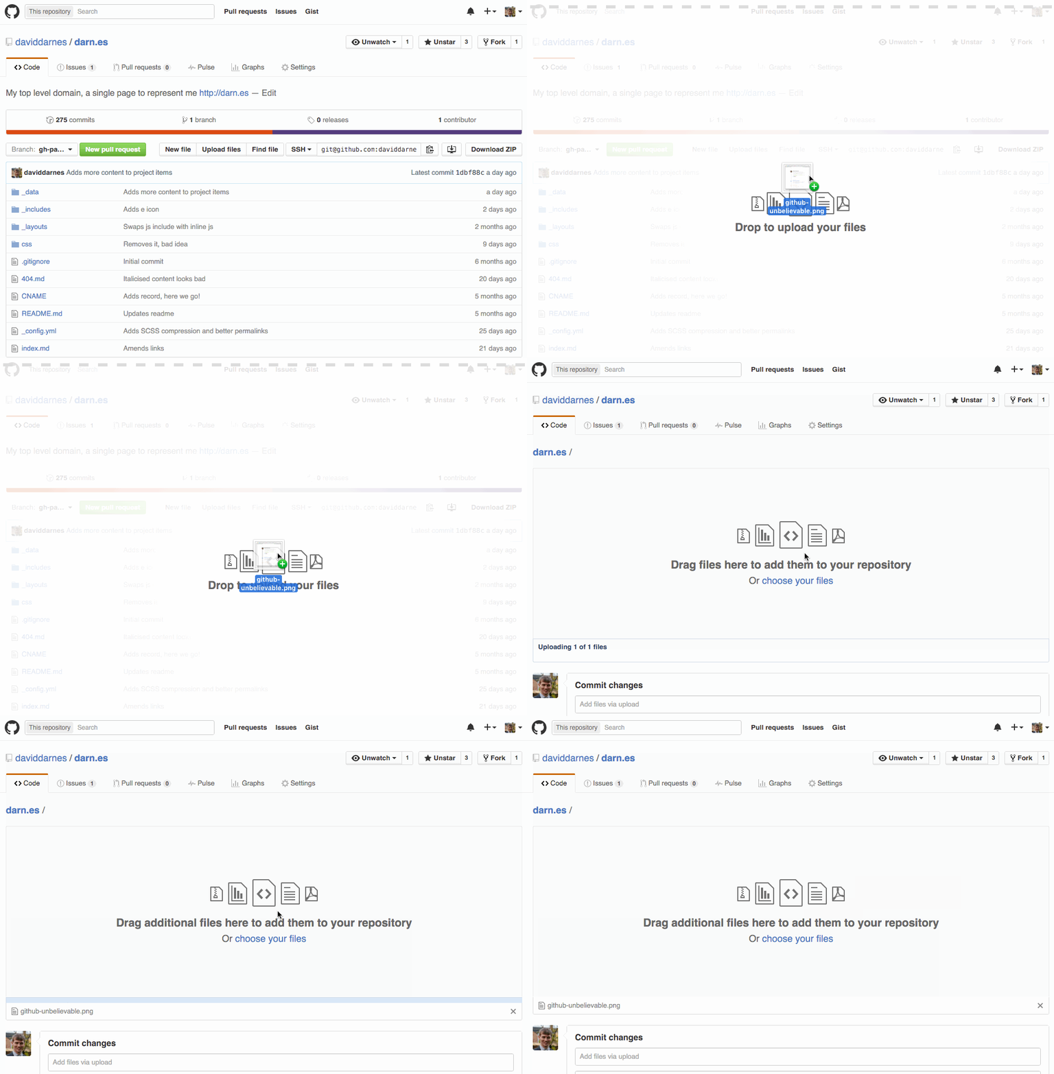
Building a site using GitHub.com was fun, but I wouldn’t advise it. I learnt a lot about their UI: the really good things and the oddly bad things. GitHub.com just needs some time to grow. With the addition of file uploading it shows that they are keen to grow as well.
Let’s not forget that the web interface isn’t designed for this. It’s there to make minor tweaks and changes that you just want to dip into. I’m still extremely impressed and grateful I was even able to achieve it, so thanks to Octocat and the rest of the gang. If you want to snoop around the code, you can checkout the repo on GitHub.
Cheers, Dave